
~ writing, programming, art ~
<< Previous next >>
29 September 2015
Trading Card Design
Did you ever collect trading cards as a child? There were baseball cards, Pokémon cards, Yu-Gi-Oh! cards, and Rumble Robots, to name a few I encountered when I was young.
If you ever tried creating your own trading cards, chances are you were more or less happy with the results. I certainly was. However, as I look back on my childhood work, I find myself quite disappointed.
If you still find yourself interested in designing trading cards, whether as collectibles or as a game, you need only employ a few, simple guidelines to achieve a traditional, high-quality design.
An Example Trading Card:
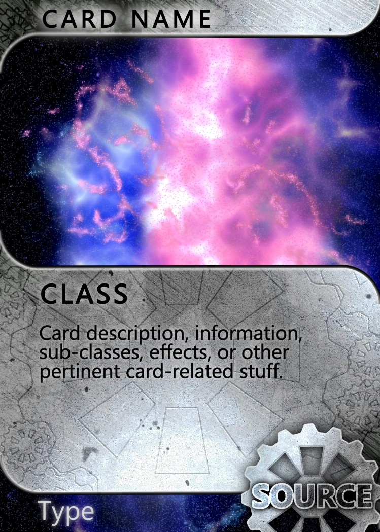
The above example combines two, hand-painted textures created in GIMP with vector-art and text created in Inkscape.
~ Guidelines (Not Rules) ~
Basic Stuff:
1) Follow the standard: 3.5" x 2.5". It just looks better.
2) Don't steal. This applies to all art, but it's especially tempting when you need fifty cards by next week. Never copy someone else's picture and then just slap a border with some text around it: it's illegal, and it's wrong. Create all your own art.
3) Work at high-resolution. Bitmap files, (such as JPG, PNG, TIFF, BMP, etc.) require at least 600 pixels per inch, although I prefer 1200 pixels per inch. Make it too big, and the computer lag will severely slow down your work-flow.
4) Bitmaps are fine for images and textures, but the final card's sharp borders and text need to be vector-art. Embed and clip the bitmap art where appropriate. This will guarantee a perfectly crisp print, whether you print straight from your favorite vector-art software or export to a 1200-1600dpi bitmap.
5) If you send your cards off to print, bear in mind that the edges might be clipped a little. Don't put anything important too close to the edges: it might be cut off.
Good Design:
1) Emphasize borders. Wherever the image ends and the background begins, make more than a sharp line. Use beveled edges, a raised-wire effect, trailing leaves; use anything, but make those edges thin but bold.
2) Put detail everywhere. I don't mean a noisy design; details should be subtle, barely detectable, but plentiful. Use subtle drop-shadows, plentiful textures, and highlights. Leave no space neglected.
3) Avoid large gradients. If you need to cover a thick border or a large panel, use a texture: wood grain, sheet metal (as in the above example), marble, stone. Learn to paint textures and enjoy your creativity! If you want a truly minimalistic design, use perfectly flat colors for everything, including the image art.
4) Match contrast and saturation levels. The background, borders, text, and the card image all need to have the same relative saturation and contrast, and matching colors never hurt anyone either. Nothing looks worse than a sharp card layout with a flatly-colored picture in the middle.
5) Use one or maybe two, fine-tuned fonts. Some layouts can get away with a different font for the title, perhaps combining cursive and print, but it's rare. The best designs use almost exclusively one font. Fine-tune your letter and line spacing, never use the default. (All decent vector-art software can do this, the "how" is just a Google search away.) Definitely avoid using a different font for every section of your card: it will look awful.
6) Blurs are your text's best friend. Is text hard to read? Duplicate it, invert the color (white->black or black->white), and blur it, then slide this blurred copy underneath the original text. This creates a shadow or glow effect which makes text readable even on a background with varying values.
That's it! Most of the stuff above is pretty obvious, some of it is a little more helpful. It's really tempting to use gradients and different fonts; but I have found them to look consistently awful.
Enjoy your new, professional trading cards! :-)